Cabinet color decisions
Warm Off-White vs Soft Cream Kitchen Cabinets: Avoiding Stark or Yellow Undertones
By KitchenRedesign AI · Remodeling finish & layout comparisons
Published · Updated
Choosing "white cabinets" sounds simple until paint chips hit your kitchen wall. Pure gallery white looks crisp beside grey quartz and chrome, yet turns unforgivingly clinical next to warm oak floors, travertine tile, or aged white door trim. Soft cream solves that clash—until cool daylight shifts creamy yellow tones muddy.
Previewing both ends of the light palette directly on your kitchen photo narrows down whether your floors and stone pull better toward neutral off-white or richer putty cream.
Warm off-white keeps trim and ceilings bright
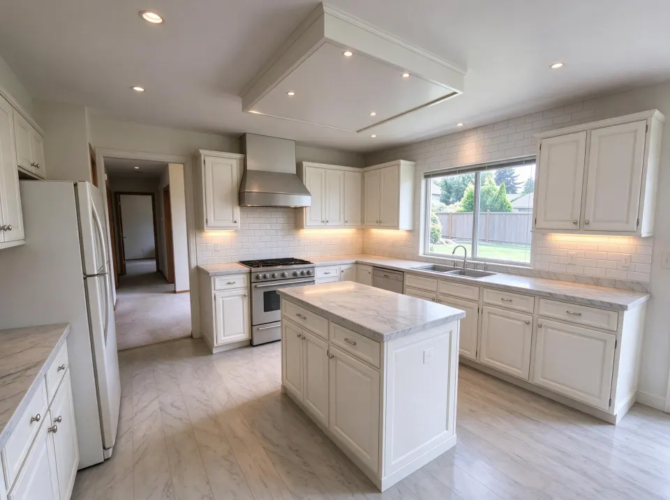
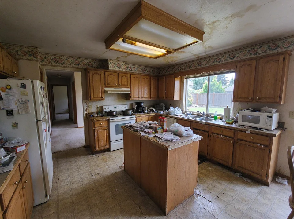
Dated wood kitchen → Classic Warm-White Shaker concept
Warm off-white Shaker doors, light veined quartz, and bright subway tile lift heavy amber wood tones while keeping window and sink walls in place.
AI concept illustration on a reference dated oak kitchen · Verify exact dimensions and paint swatches physically · 2026-11-18
Now test this look on your own kitchen
Start with a clear daytime photo of your cabinets and counters.
In Classic White Shaker, soft off-white avoids the sterile blue glare of cool industrial whites while staying visibly cleaner and fresher than beige. It excels when your ceilings are bright ceiling white and your counters lean pale grey or neutral alabaster.
Putty cream bridges earthy granite and terracotta tiles
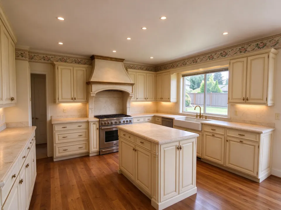
Soft warm cream paneled doors paired with honed warm stone
Warm putty cream avoids clashing with yellow or beige undertones in older natural stone countertops.
AI concept illustration on a reference dated oak kitchen · Verify exact dimensions and paint swatches physically · 2026-11-18
When existing gold-veined granite, travertine backsplash tiles, or honey-toned wood dining tables stay in place, French Country cream blends naturally instead of making the floor look dingy.
| Undertone Check | Choose Warm Off-White | Choose Soft Putty Cream |
|---|---|---|
| Cool grey/blue veined marble quartz | Best match | Can appear overly yellow beside cool white stone |
| Brown, tan, or gold speckled granite | Risk of harsh contrast | Ties stone flecks smoothly to walls |
| Pure white door trim & baseboards | Crisp transition | Works best with subtle greige wall paint |
| North-facing dim kitchen | Retains clean brightness | Needs warm 2700K–3000K lighting to avoid dullness |
Physical sample test you must run before painting
- Prop a pure-white printer sheet directly beside your warm white and cream painted sample boards on cabinet lowers.
- Check both samples under evening kitchen bulbs as well as noon window glare.
- Run a quick comparison in KitchenRedesign AI using Cabinets only to see if light cream softens your counters without yellowing the walls.
Further planning reading
- NKBA: Kitchen Design & Remodeling GuidelinesColor reflectance and cabinet surface standards.