Cabinet color decisions
Contrasting Kitchen Island vs Matching Perimeter Cabinets: When an Accent Island Works
By KitchenRedesign AI · Remodeling finish & layout comparisons
Published · Updated
Painting or staining the kitchen island a contrasting color is the lowest-risk way to introduce bold color or natural wood warmth without darkening upper walls. Yet an accent island isn't always helpful—on tiny peninsulas or narrow walkways, switching base colors too abruptly can make an island feel visually stranded.
Inside KitchenRedesign AI, setting Kitchen Zone to Island only isolates that exact decision while preserving every perimeter box, appliance, and backsplash tile.
When an accent island elevates the layout
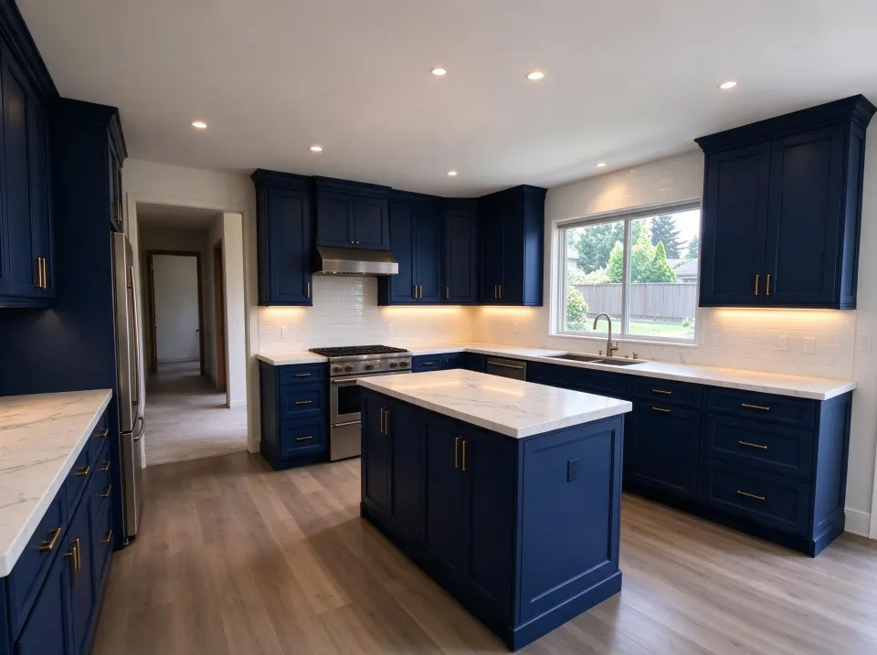
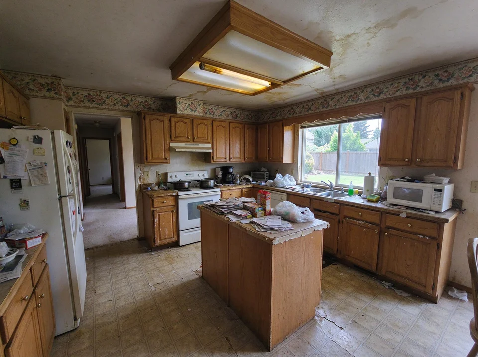
Full saturated color: deep navy Shaker cabinetry with warm brass
Full-height navy increases contrast dramatically; inspect shaded wall corners and ceiling junctions carefully against your own window light.
AI concept illustration on a reference dated oak kitchen · Verify exact dimensions and paint swatches physically · 2026-11-18
Now test this look on your own kitchen
Start with a clear daytime photo of your cabinets and counters.
An accent finish—like deep Navy & Brass, warm Sage Green Shaker, or Warm White Oak against clean white perimeter cabinets—works best when: - Your island seats two to four stools facing an open living/dining space, acting like a piece of furniture. - You love saturated navy or matte black, yet perimeter walls lack the sunlight to carry dark upper doors. - You want wood warmth on the island without matching wood floors box-for-box.
When matching the perimeter looks bigger
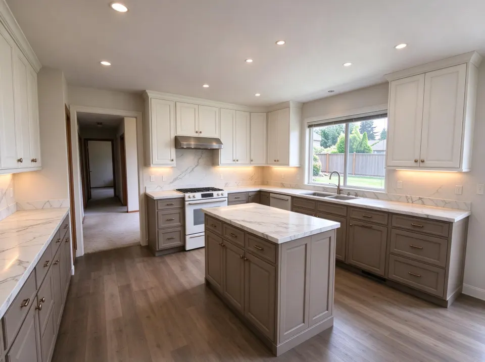
Two-tone balance: crisp white uppers with deeper greige lowers
Light upper doors blend cleanly toward the ceiling while grounded greige base cabinets hide lower wear and anchor the center.
AI concept illustration on a reference dated oak kitchen · Verify exact dimensions and paint swatches physically · 2026-11-18
If your island is an attached U-shaped peninsula or less than 5 feet wide, matching it to the rest of the base cabinets (or pairing light uppers with Two-Tone Cabinets across all lowers) avoids cutting the floor plane into chopped blocks.
| Island Configuration | Accent Island Color | Matching Perimeter Color |
|---|---|---|
| Large freestanding 7–10 ft island | Anchors open floor plan beautifully | Can feel monolithic in pure snow white |
| Attached short peninsula | Can look like an odd tacked-on leg | Flows uninterrupted into base cabinet run |
| Heavy barstool scuff zone | Darker navy, sage, or stained oak hides heel marks | White paint shows shoe scuffs faster |
Test Island only in KitchenRedesign AI using a wide photo standing from the dining or living area so stools and walkway edges stay visible.
Further planning reading
- NKBA: Kitchen Island Design GuidelinesFunctional focal hierarchy and seating sightline balance.